Intended for healthcare professionals
Home/About BMJ/Resources for readers/Publications/Statistics at square one/1. Data display and summary
1. Data display and summary
Types of data
The first step, before any calculations or plotting of data, is to decide what type of data one is dealing with. There are a number of typologies, but one that has proven useful is given in Table 1.1. The basic distinction is between quantitative variables (for which one asks “how much?”) and categorical variables (for which one asks “what type?”).
Quantitative variables can be continuous or discrete. Continuous variables, such as height, can in theory take any value within a given range. Examples of discrete variables are: number of children in a family, number of attacks of asthma per week.
Categorical variables are either nominal (unordered) or ordinal (ordered). Examples of nominal variables are male/female, alive/dead, blood group O, A, B, AB. For nominal variables with more than two categories the order does not matter. For example, one cannot say that people in blood group B lie between those in A and those in AB. Sometimes, however, people can provide ordered responses, such as grade of breast cancer, or they can “agree”, “neither agree nor disagree”, or “disagree” with some statement. In this case the order does matter and it is usually important to account for it.
Table 1.1
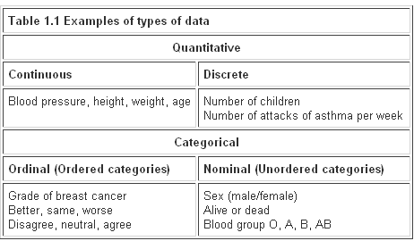
Variables shown at the left of Table 1.1 can be converted to ones further to the right by using “cut off points”. For example, blood pressure can be turned into a nominal variable by defining “hypertension” as a diastolic blood pressure greater than 90 mmHg, and “normotension” as blood pressure less than or equal to 90 mmHg. Height (continuous) can be converted into “short”, average” or “tall” (ordinal).
In general it is easier to summarise categorical variables, and so quantitative variables are often converted to categorical ones for descriptive purposes. To make a clinical decision on someone, one does not need to know the exact serum potassium level (continuous) but whether it is within the normal range (nominal). It may be easier to think of the proportion of the population who are hypertensive than the distribution of blood pressure. However, categorising a continuous variable reduces the amount of information available and statistical tests will in general be more sensitive – that is they will have more power (see Chapter 5 for a definition of power) for a continuous variable than the corresponding nominal one, although more assumptions may have to be made about the data. Categorising data is therefore useful for summarising results, but not for statistical analysis. It is often not appreciated that the choice of appropriate cut off points can be difficult, and different choices can lead to different conclusions about a set of data.
These definitions of types of data are not unique, nor are they mutually exclusive, and are given as an aid to help an investigator decide how to display and analyse data. One should not debate overlong the typology of a particular variable!
Stem and leaf plots
Before any statistical calculation, even the simplest, is performed the data should be tabulated or plotted. If they are quantitative and relatively few, say up to about 30, they are conveniently written down in order of size.
For example, a paediatric registrar in a district general hospital is investigating the amount of lead in the urine of children from a nearby housing estate. In a particular street there are 15 children whose ages range from 1 year to under 16, and in a preliminary study the registrar has found the following amounts of urinary lead ( ), given in Table 1.2 what is called an array:
Table 1.2
<

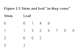
A simple way to order, and also to display, the data is to use a stem and leaf plot. To do this we need to abbreviate the observations to two significant digits. In the case of the urinary concentration data, the digit to the left of the decimal point is the “stem” and the digit to the right the “leaf”.
We first write the stems in order down the page. We then work along the data set, writing the leaves down “as they come”. Thus, for the first data point, we write a 6 opposite the 0 stem. These are as given in Figure 1.1.
Figure 1.1
We then order the leaves, as in Figure 1.2
Figure 1.2
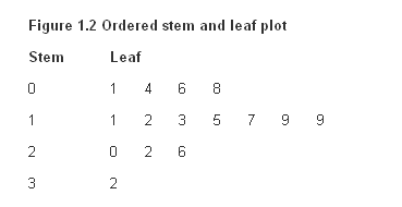
The advantage of first setting the figures out in order of size and not simply feeding them straight from notes into a calculator (for example, to find their mean) is that the relation of each to the next can be looked at. Is there a steady progression, a noteworthy hump, a considerable gap? Simple inspection can disclose irregularities. Furthermore, a glance at the figures gives information on their range. The smallest value is 0.1 and the largest is 3.2 .
Median
To find the median (or mid point) we need to identify the point which has the property that half the data are greater than it, and half the data are less than it. For 15 points, the mid point is clearly the eighth largest, so that seven points are less than the median, and seven points are greater than it. This is easily obtained from Figure 1.2 by counting the eighth leaf, which is 1.5 .
To find the median for an even number of points, the procedure is as follows. Suppose the paediatric registrar obtained a further set of 16 urinary lead concentrations from children living in the countryside in the same county as the hospital.(Table 1.3)
Table 1.3

To obtain the median we average the eighth and ninth points (1.8 and 1.9) to get 1.85. In general, if n is even, we average the n/2th largest and the n/2 + 1th largest observations.
The main advantage of using the median as a measure of location is that it is “robust” to outliers. For example, if we had accidentally written 34 rather than 3.4 in Table 1.2 , the median would still have been 1.85. One disadvantage is that it is tedious to order a large number of observations by hand (there is usually no “median” button on a calculator).
Measures of variation
It is informative to have some measure of the variation of observations about the median. The range is very susceptible to what are known as outliers, points well outside the main body of the data. For example, if we had made the mistake of writing 34 instead 3.4 in Table 1.2, then the range would be written as 0.1 to 34 which is clearly misleading.
A more robust approach is to divide the distribution of the data into four, and find the points below which are 25%, 50% and 75% of the distribution. These are known as quartiles, and the median is the second quartile. The variation of the data can be summarised in the interquartile range, the distance between the first and third quartile. With small data sets and if the sample size is not divisible by four, it may not be possible to divide the data set into exact quarters, and there are a variety of proposed methods to estimate the quartiles. A simple, consistent method is to find the points midway between each end of the range and the median. Thus, from Figure 1.2, there are eight points between and including the smallest, 0.1, and the median, 1.5. Thus the mid point lies between 0.8 and 1.1, or 0.95. This is the first quartile. Similarly the third quartile is mid way between 1.9 and 2.0, or 1.95. Thus, the interquartile range is 0.95 to 1.95 .
Data display
The simplest way to show data is a dot plot. Figure 1.3 shows the data from tables 1.2 and 1.3 and together with the median for each set.
Figure 1.3
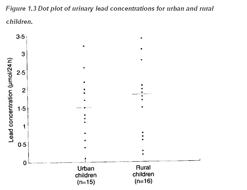
Sometimes the points in separate plots may be linked in some way, for example the data in Table 1.2 and Table 1.3 may result from a matched case control study (see Chapter 13 for a description of this type of study) in which individuals from the countryside were matched by age and sex with individuals from the town. If possible the links should be maintained in the display, for example by joining matching individuals in Figure 1.3. This can lead to a more sensitive way of examining the data.
When the data sets are large, plotting individual points can be cumbersome. An alternative is a box-whisker plot. The box is marked by the first and third quartile, and the whiskers extend to the range. The median is also marked in the box, as shown in Figure 1.4
Figure 1.4
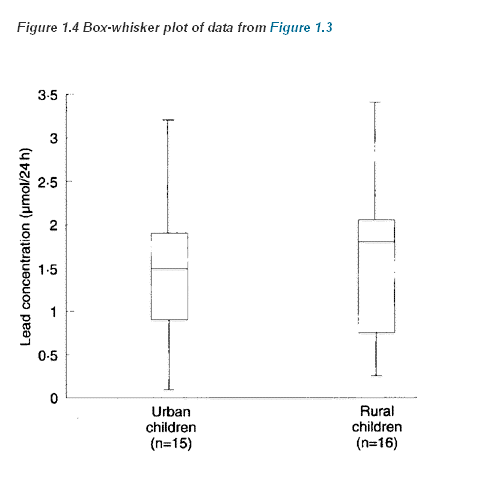
It is easy to include more information in a box-whisker plot. One method, which is implemented in some computer programs, is to extend the whiskers only to points that are 1.5 times the interquartile range below the first quartile or above the third quartile, and to show remaining points as dots, so that the number of outlying points is shown.
Histograms
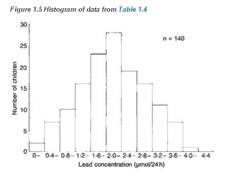
Suppose the paediatric registrar referred to earlier extends the urban study to the entire estate in which the children live. He obtains figures for the urinary lead concentration in 140 children aged over 1 year and under 16. We can display these data as a grouped frequency table (Table 1.4).
Table 1.4
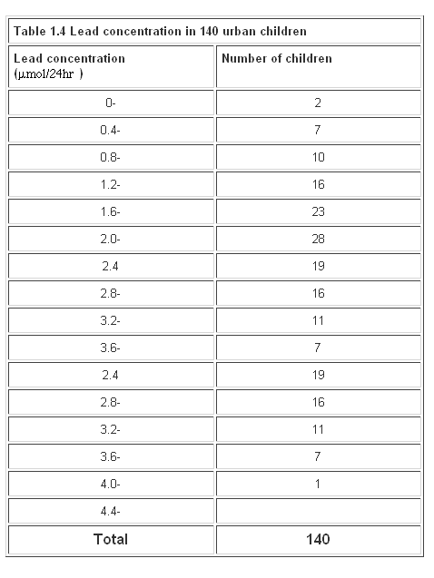
Figure 1.5
Bar charts
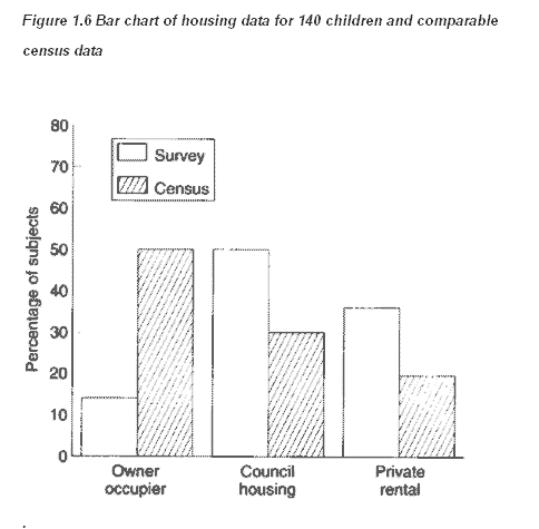
Suppose, of the 140 children, 20 lived in owner occupied houses, 70 lived in council houses and 50 lived in private rented accommodation. Figures from the census suggest that for this age group, throughout the county, 50% live in owner occupied houses, 30% in council houses, and 20% in private rented accommodation. Type of accommodation is a categorical variable, which can be displayed in a bar chart. We first express our data as percentages:
14% owner occupied, 50% council house, 36% private rented. We then display the data as a bar chart. The sample size should always be given (Figure 1.6).
Figure 1.6
Common questions
How many groups should I have for a histogram?
In general one should choose enough groups to show the shape of a distribution, but not too many to lose the shape in the noise. It is partly aesthetic judgement but, in general, between 5 and 15, depending on the sample size, gives a reasonable picture. Try to keep the intervals (known also as “bin widths”) equal. With equal intervals the height of the bars and the area of the bars are both proportional to the number of subjects in the group. With unequal intervals this link is lost, and interpretation of the figure can be difficult.
What is the distinction between a histogram and a bar chart?
Alas, with modern graphics programs the distinction is often lost. A histogram shows the distribution of a continuous variable and, since the variable is continuous, there should be no gaps between the bars. A bar chart shows the distribution of a discrete variable or a categorical one, and so will have spaces between the bars. It is a mistake to use a bar chart to display a summary statistic such as a mean, particularly when it is accompanied by some measure of variation to produce a “dynamite plunger plot”(1). It is better to use a box-whisker plot.
What is the best way to display data?
The general principle should be, as far as possible, to show the original data and to try not to obscure the desigu of a study in the display. Within the constraints of legibility show as much information as possible. If data points are matched or from the same patients link them with lines. (2) When displaying the relationship between two quantitative variables, use a scatter plot (Chapter 11) in preference to categorising one or both of the variables.
References
1. Campbell M J. How to present numerical results. In: How to do it: 2.London: BMJ Publishing, 1995:77-83.
2. Matthews J N S, Altman D G, Campbell M J, Royston J P. Analysis of serial measurements in medical research. BMJ1990; 300:230-5.
Exercises
Exercise 1.1
From the 140 children whose urinary concentration of lead were investigated 40 were chosen who were aged at least 1 year but under 5 years. The following concentrations of copper (in ) were found.
0.70, 0.45, 0.72, 0.30, 1.16, 0.69, 0.83, 0.74, 1.24, 0.77,
0.65, 0.76, 0.42, 0.94, 0.36, 0.98, 0.64, 0.90, 0.63, 0.55,
0.78, 0.10, 0.52, 0.42, 0.58, 0.62, 1.12, 0.86, 0.74, 1.04,
0.65, 0.66, 0.81, 0.48, 0.85, 0.75, 0.73, 0.50, 0.34, 0.88
Find the median, range and quartiles.